Oakley Custom
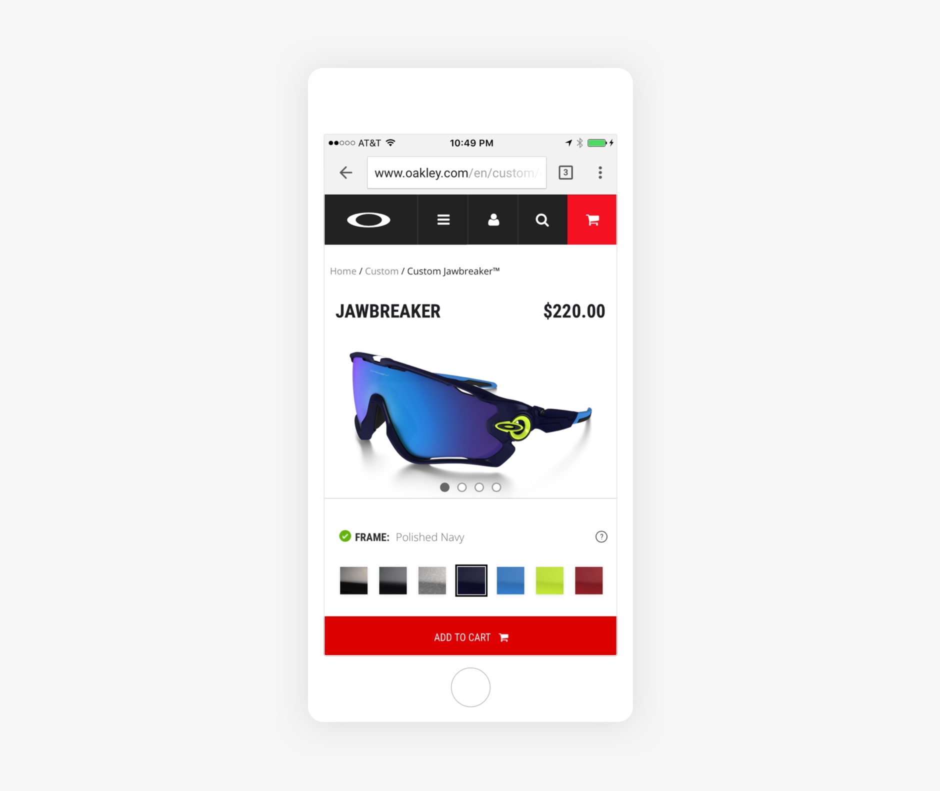
Mobile traffic was rapidly increasing for oakley.com. The existing Custom experience had three key problems:
- The existing interface didn’t match the latest product detail page interface, which broke consistency across a user journey
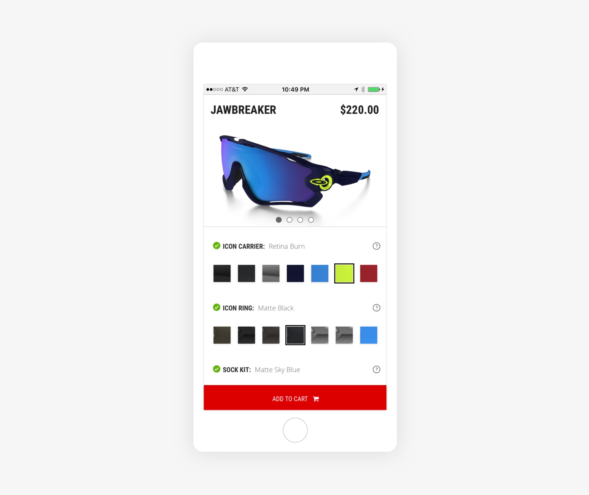
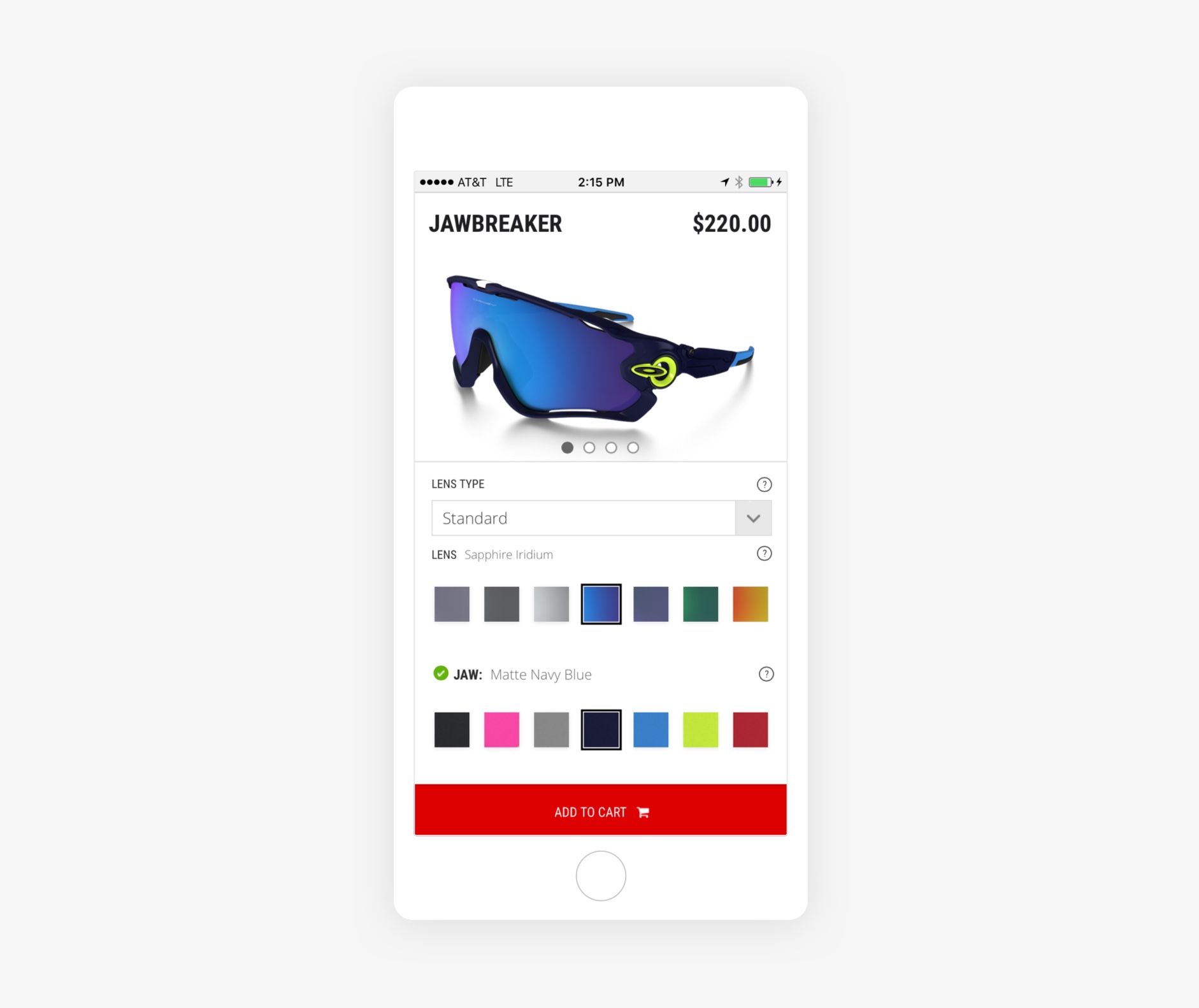
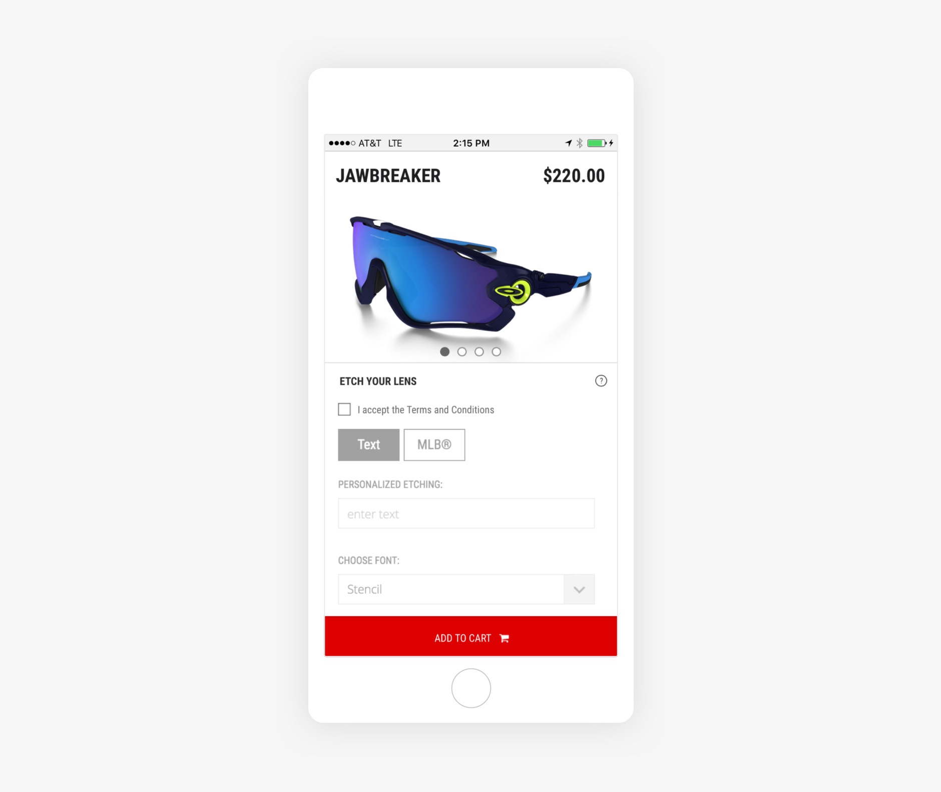
- A user couldn’t instantly see her changes in the product image because it scrolled with the page
- The Add to Cart button was out of view until a user scrolled
I directed early UI/UX explorations in collaboration with another designer. I finished the visual design while coordinating with cross-functional teams through launch. We matched the product detail page interface so users wouldn’t be confused by a different UI.
We fixed the Add to Cart button to the bottom of the viewport until a user scrolled to the footer. This kept the Add to Cart button front and center.
The scrolling solution was a front-end development challenge, but I worked closely with the development team to launch the experience we envisioned.
Live site: Oakley Custom


Thanks for reading 🙏🏻