eResolve
No arguing. No threats. Choose your own path. eResolve is a human-friendly, digital first approach to collections. Traditionally, debt collectors feel hostile, threatening and inflexible. eResolve replaces the old experience by speaking to consumers respectfully and giving them flexible payment options.
Role
I spent some time digging into some existing user interviews and insights to familiarize myself with the product and how it could better meet the needs of its users. Translating the insights into action items allowed me to create a picture of how to improve eResolve. I needed to:
- Simplify the content strategy
- Re-think the user flow
- Refresh the visual design
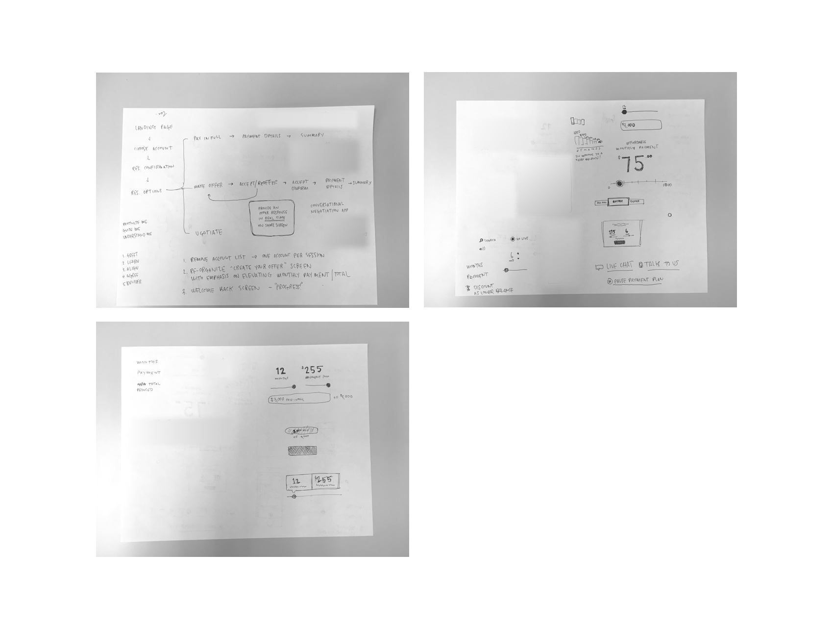
After jotting down some thoughts and ideas, I sketched them out to see the form. After multiple iterations of sketches and rough prototypes, I presented a refined prototype to stakeholders and the development team.
Now I’m working a designer on my team to flesh out the visual design. She’s addressing things like different states of the UI and thinking through some alternative approaches to a few steps in the flow. We’re also beginning to meet and align with the development team since we will work together with them through the development process to ensure the design is executed, with special attention to interaction, performance and device support.
Challenges
- The early version of eResolve was jam-packed with extra information and heavy on decorations. This left users unsure of where to look or what to do.
- We wanted the user to have more control by negotiating payment amounts, terms and dates but also set parameters that a financial institution would be comfortable accepting. We are currently exploring if/how we can leverage data to intelligently propose terms that work well for both the user and the financial institution.
- After a user agrees to a payment plan, what’s the best way to interact with them? Payment reminder options, progress updates, and pay-off celebrations are all being considered as options to continue the human-friendly approach outside of the initial experience.
Solution
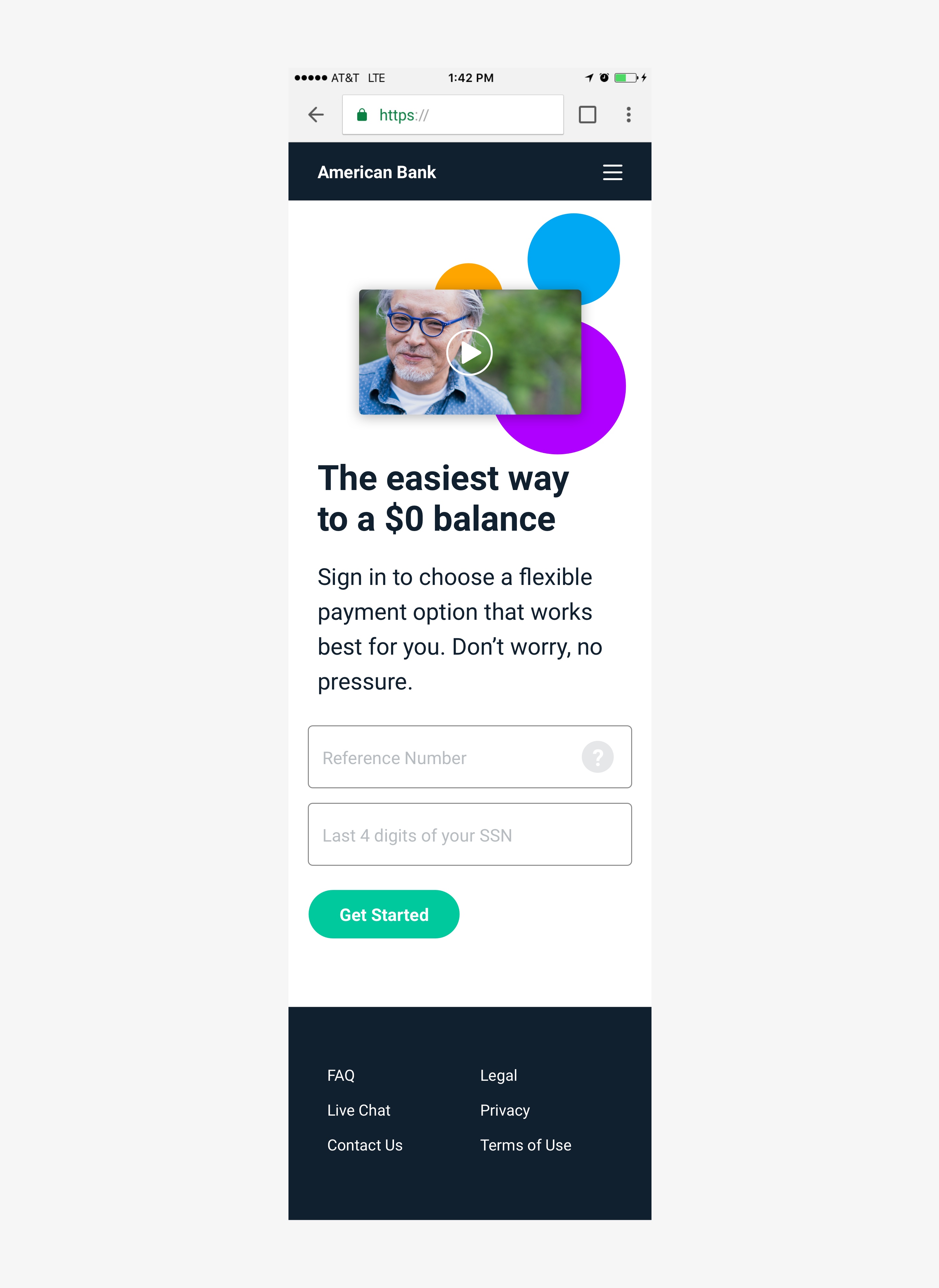
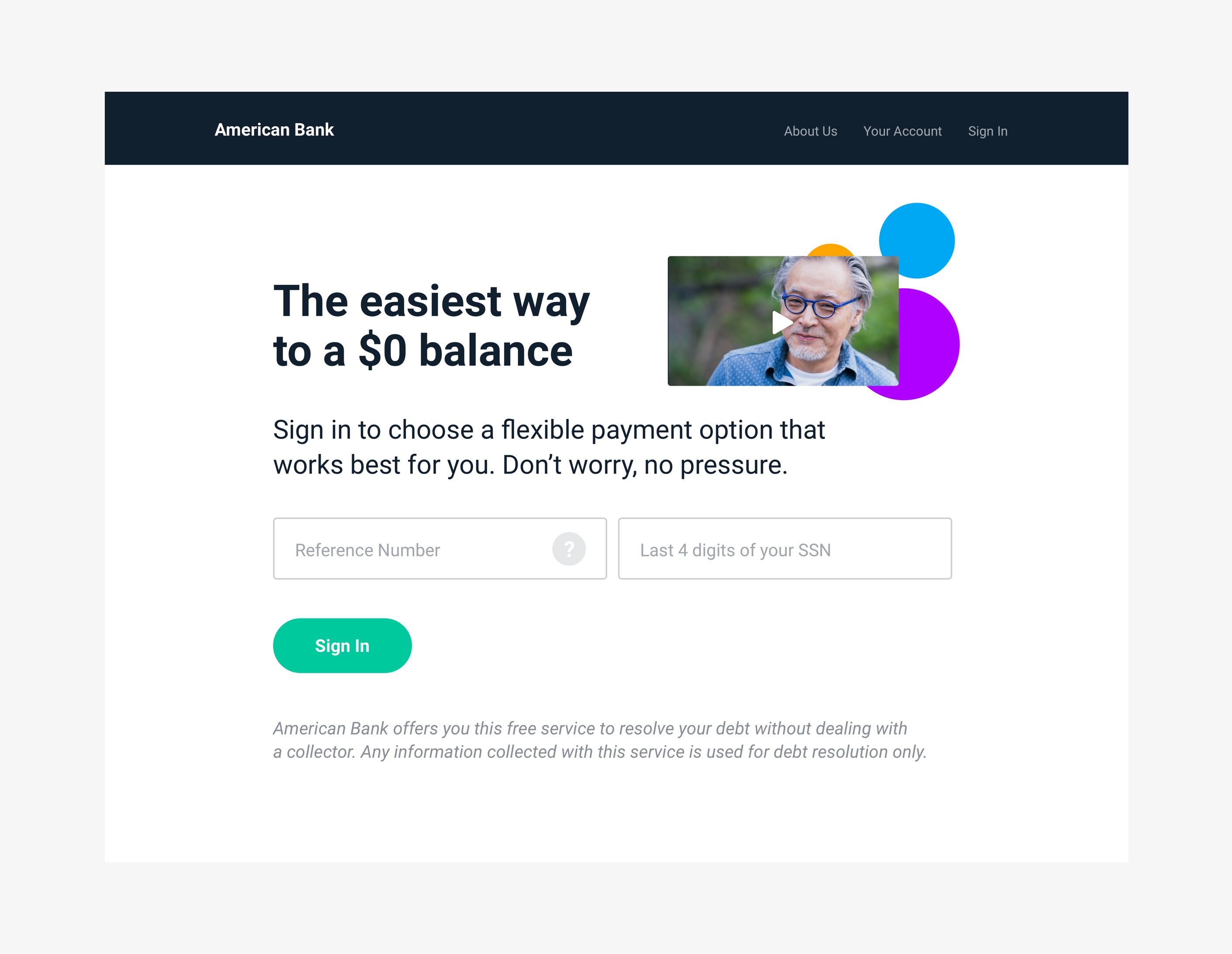
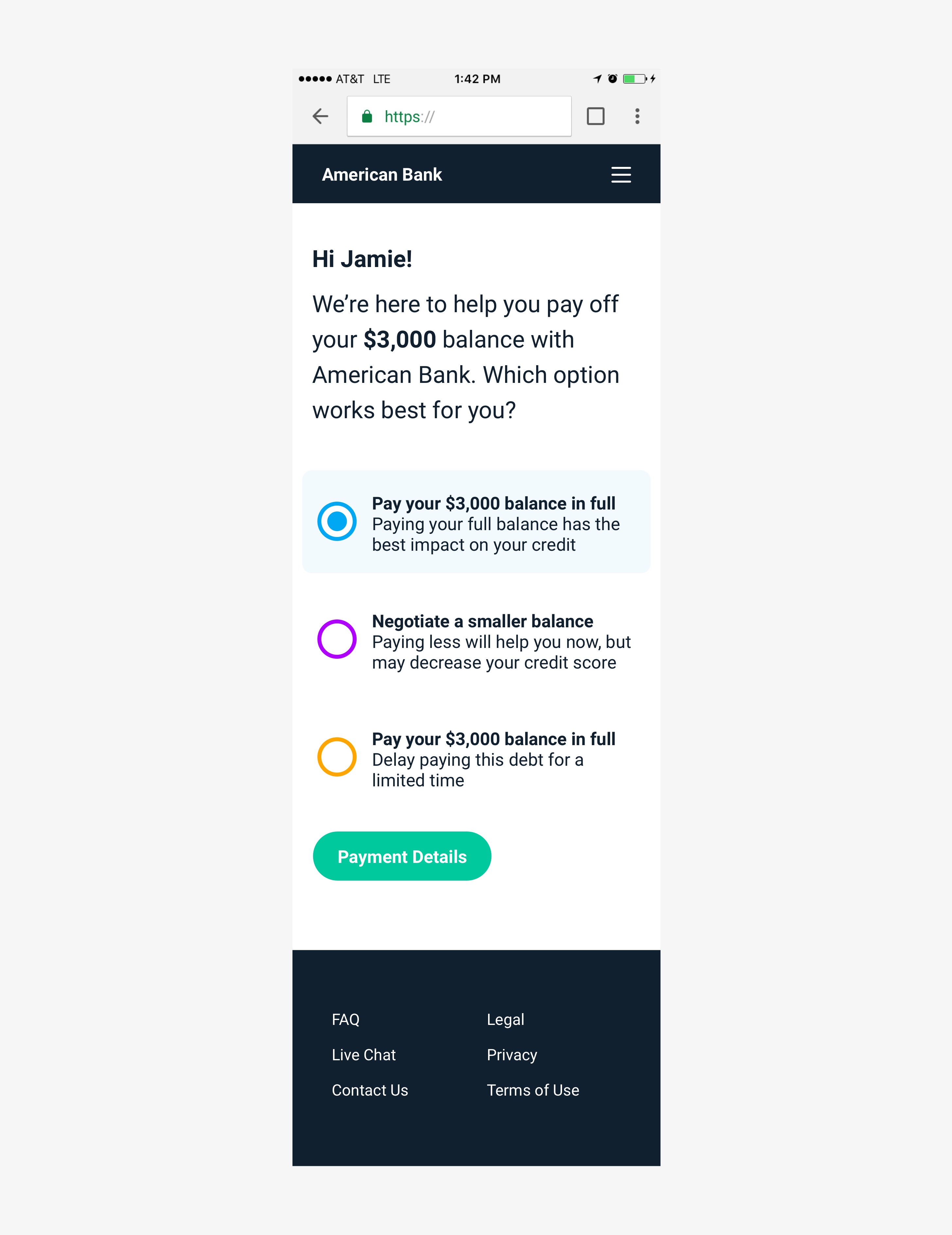
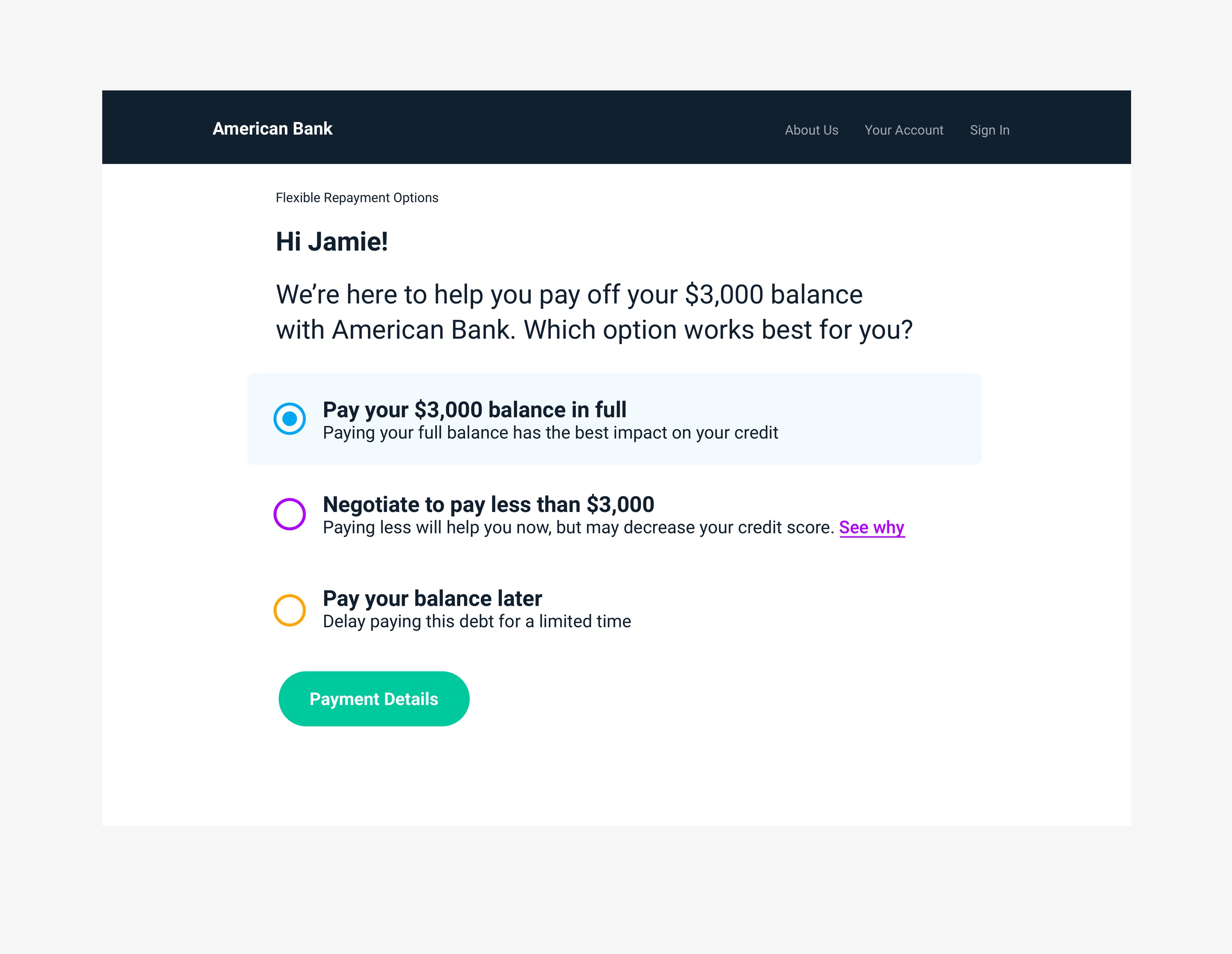
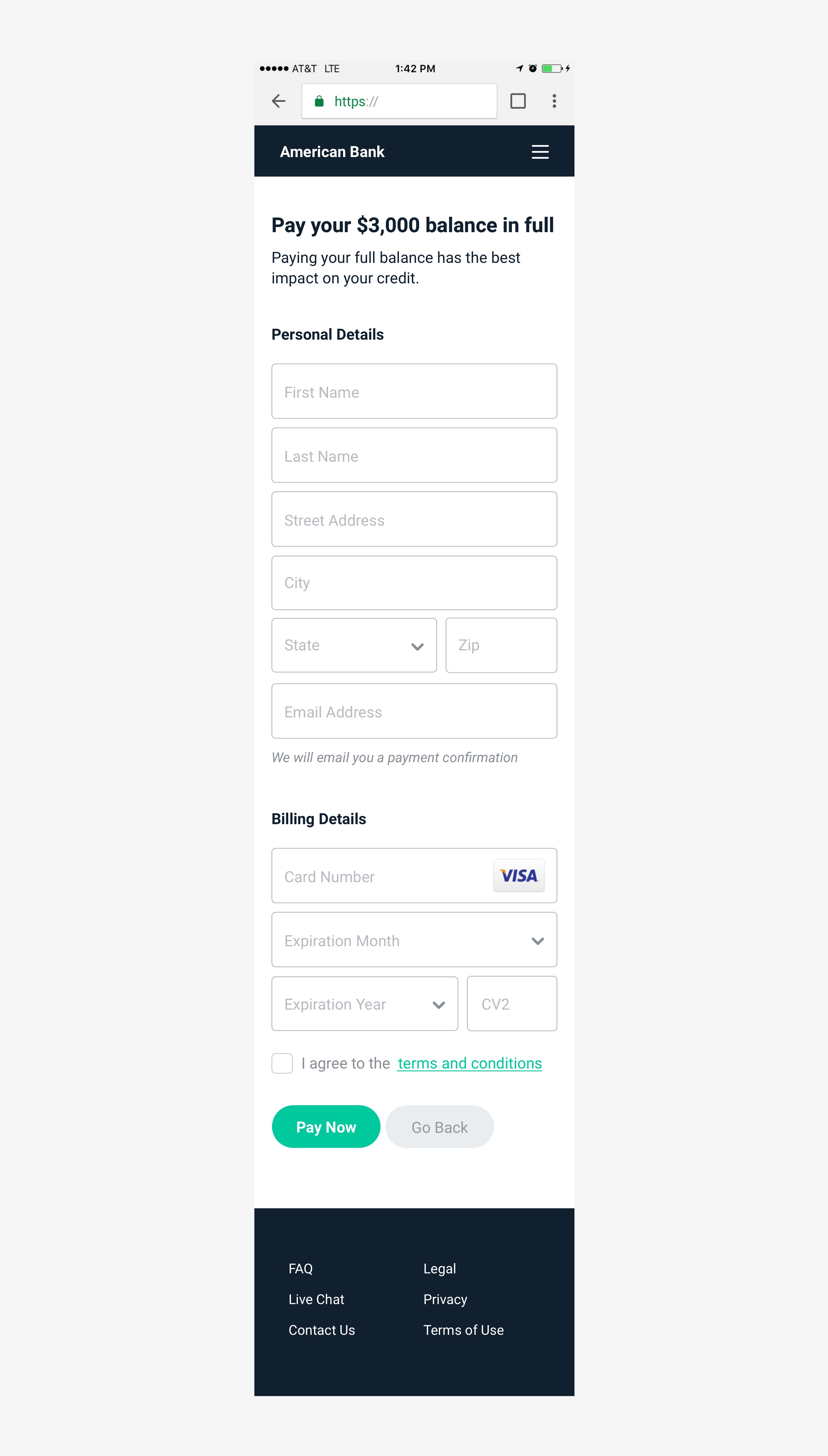
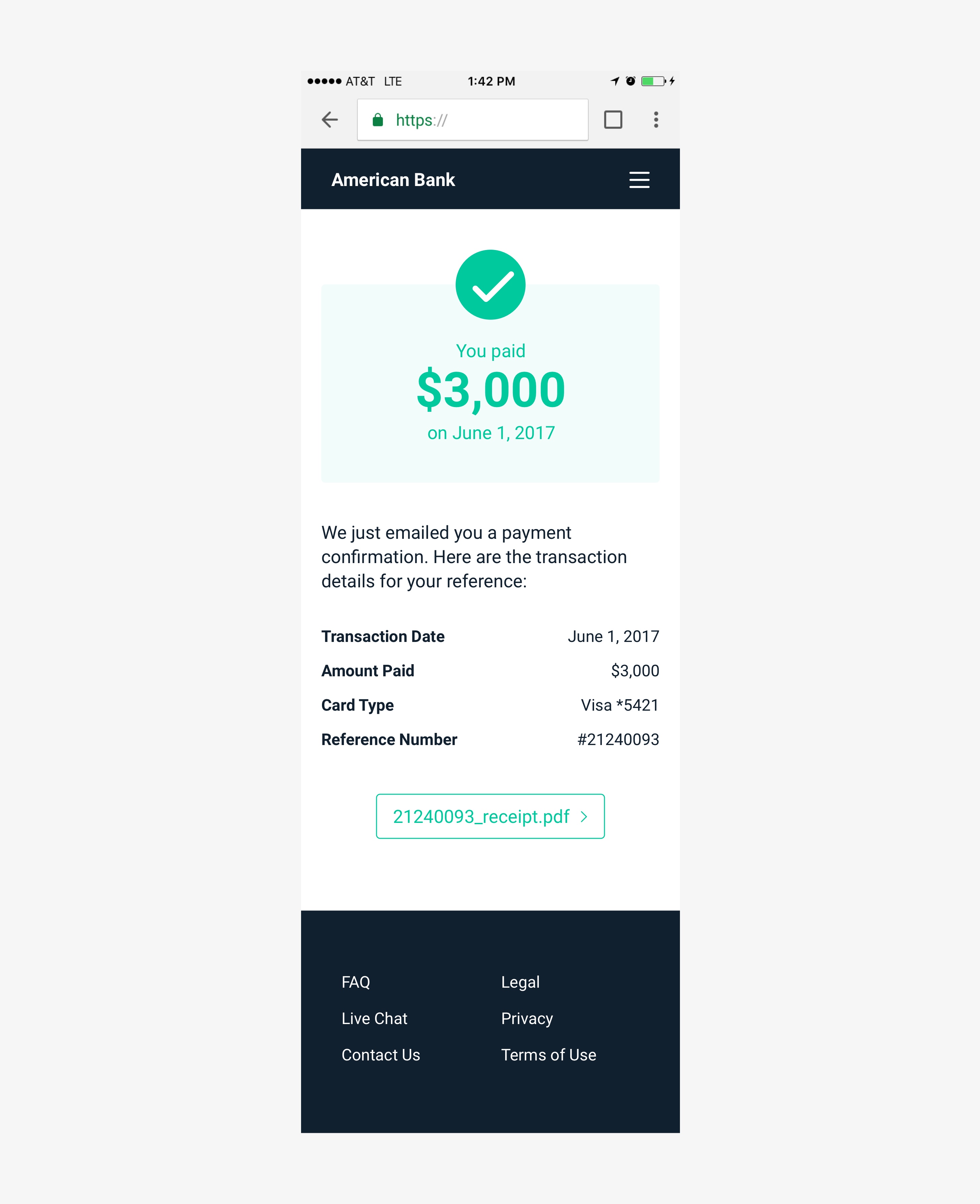
- We simplified the user flow by taking a “one thing per page” approach: instead of putting everything on one screen, we separated the process into multiple, minimal screens.
- We cleaned up the interface by removing extraneous containers, shapes, shadows and a complex layout. We added a clear typographic hierarchy, friendly color scheme and straightforward single-column layout.
These sketches show some exploration of simplified user journeys and different ways we could visualize flexible payment options and how they look as a monthly plan.
What I have learned (so far)
Data is everything. The research done before I arrived paved the way to a data-driven design approach. I can reference it to justify every design decision made.
Thanks for reading 🙏🏻