Oakley 😎
At Oakley, I worked with the interaction design team, internal and external stakeholders and third-party vendors to design several native apps including Mad Science and Radar Pace. We also shipped UX/UI, front-end development and back-end integration for oakley.com’s e-commerce and marketing web experiences. In 2015, Oakley.com generated approximately $60M in revenue and approximately 36M sessions.
Radar Pace
Overview
Oakley and Intel partnered to create Radar Pace, a real-time voice activated coaching system leveraging sensor-driven eyewear and your iOS or Android smartphone.
Role
I worked with Intel’s New Devices Group UI/UX team to whiteboard ideas, create prototypes, conduct user research, present findings to stakeholders and iterate on UI/UX for Radar Pace on iOS and Android platforms. My primary role was to ensure the overall digital experience and visual design of the app met Oakley’s standards for product design.
Challenges
[Writing this now]
Solutions
[Writing this now - Will touch on main sections of the app and how we arrived at the solution, visual design and working with voice interactions]
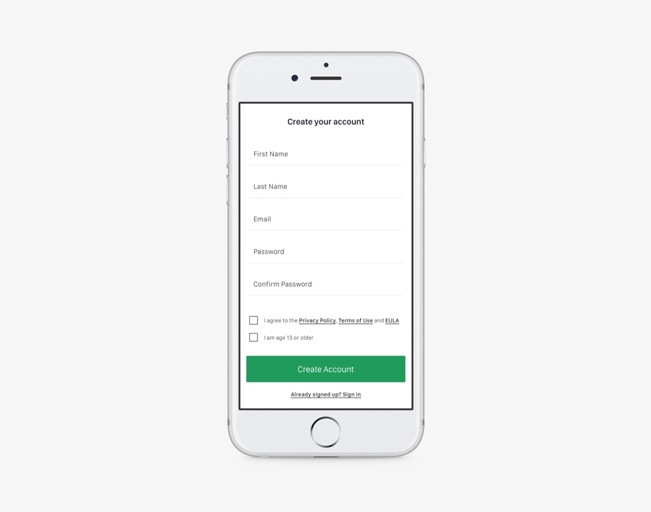
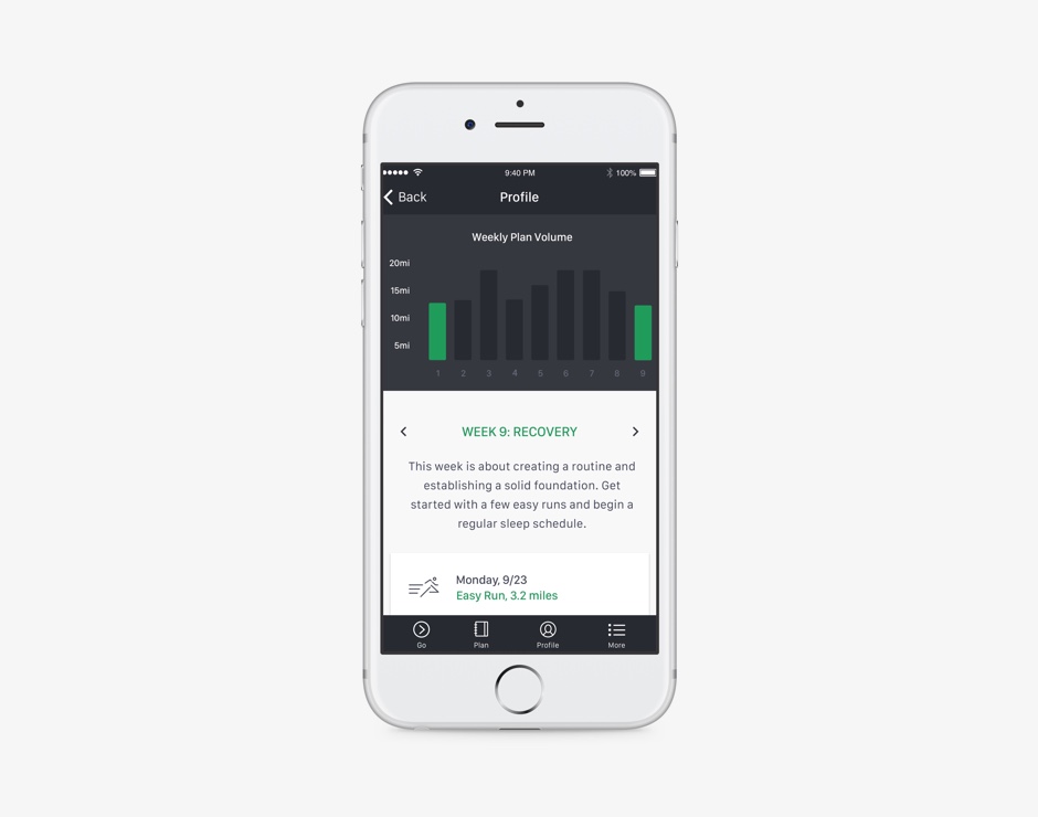
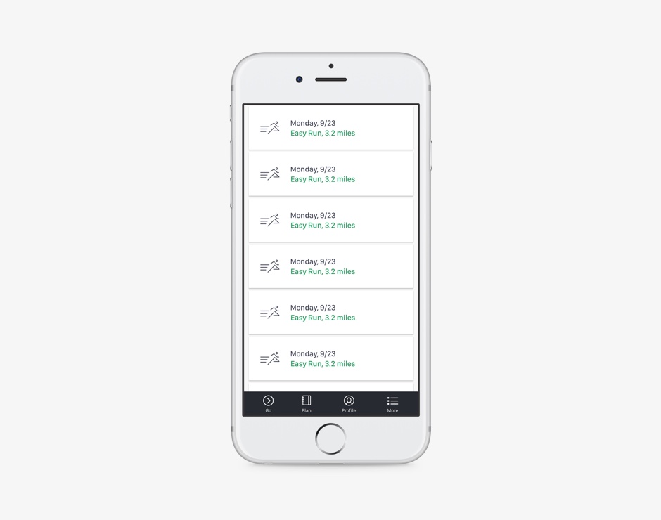
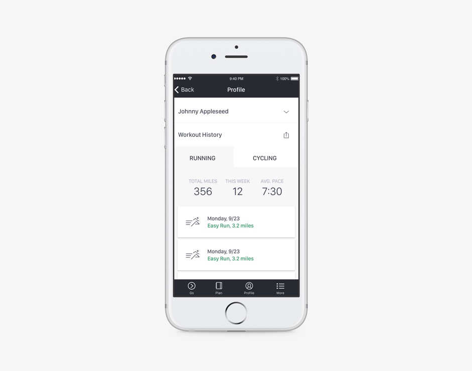
Here are a few screens showing the Profile and Plan sections of the app. These give you a good sense of the organization of the app and the visual design. [More screens needed?]
What I learned
• We got too far into the design before we put the product in front of people for feedback. Prototype as early as possible.
• Most of the user research we did later on was in a board room. Testing prototypes with users in the intended environment provides more accurate feedback and drives clearer insights. This give us meaningful data to take action on, leading to a more focused product. This did happen later, but after the product was nearly built, costing time and money when iterating.
• The product shipped later than intended because so many features were mandated into the launch. Launching with a MVP would have shortened the development timeline, brought us to market earlier and afforded us validated learning for future iterations.
Oakley Custom
Overview
Custom accounts for a large part of Oakley’s direct-to-consumer business. The oakley.com Custom back-end was built by Fluid and maintained by Oakley’s e-commerce team, led by Custom PM George Steihl. The interaction design team led UI/UX for the experience.
Role
For the first half of the project, I directed the design in collaboration with Aaron Dodson. After Aaron left Oakley, I continued iterating on the design while coordinating deliverables and constant communication with the development team, all in sync with George.
Challenges
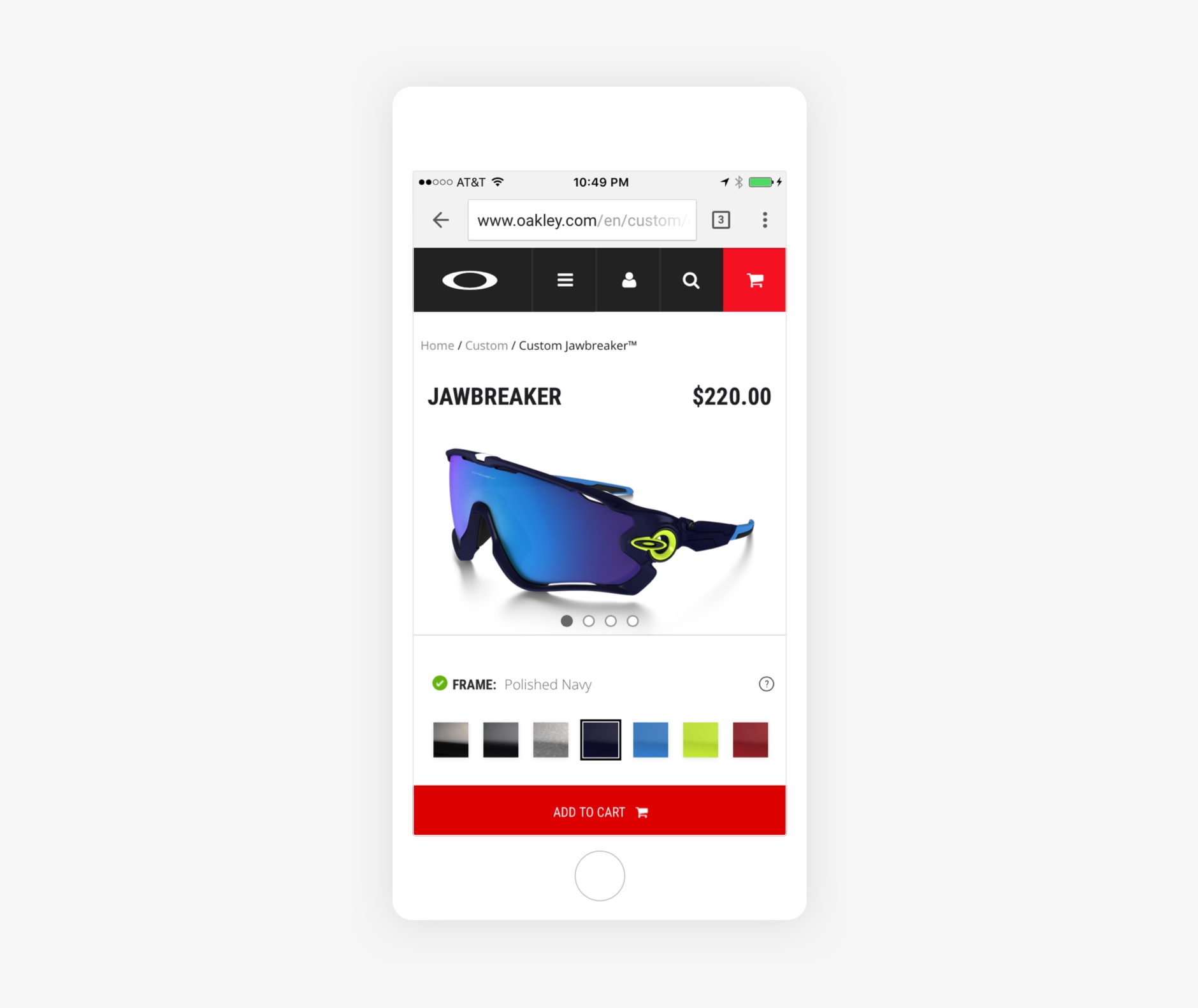
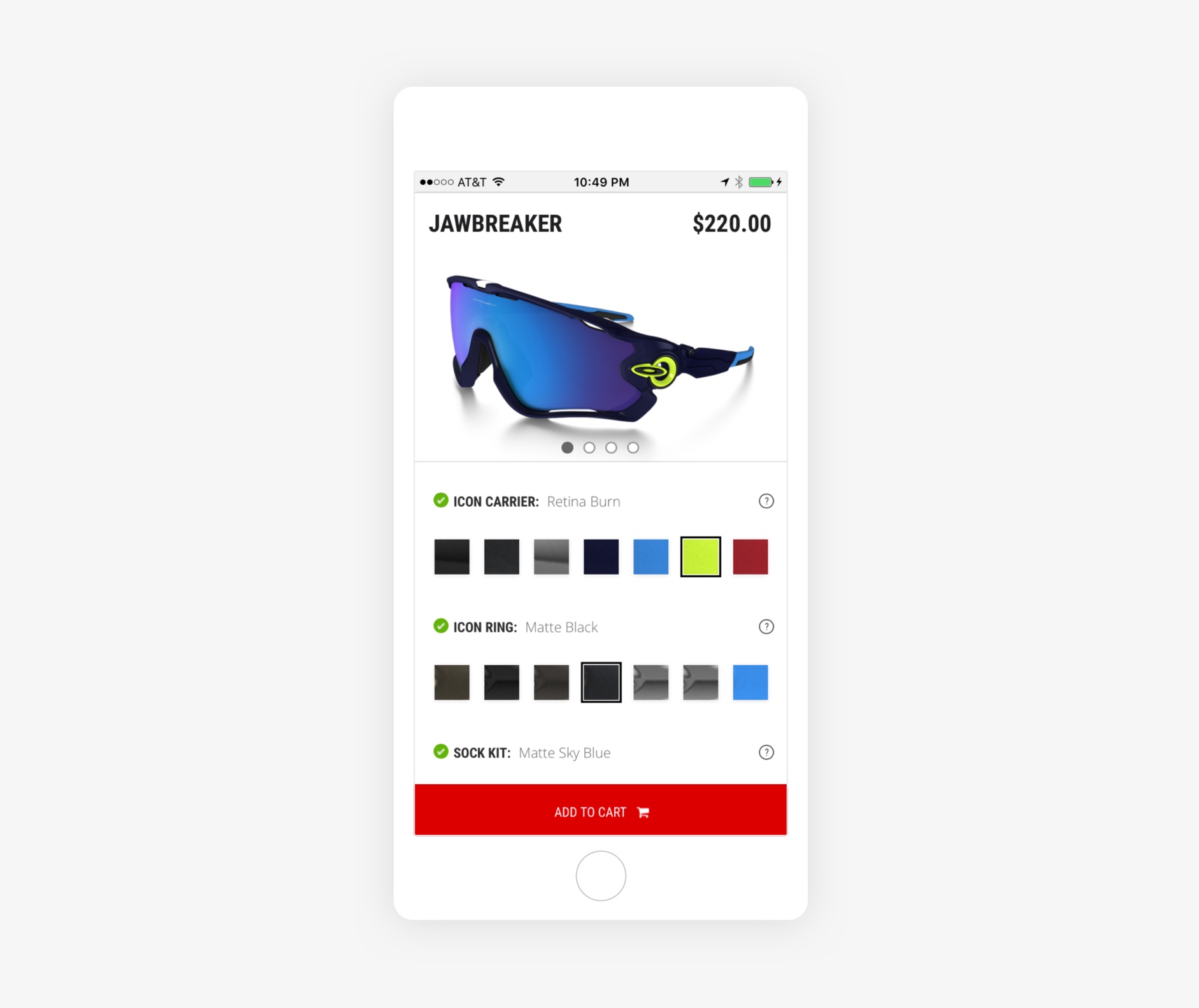
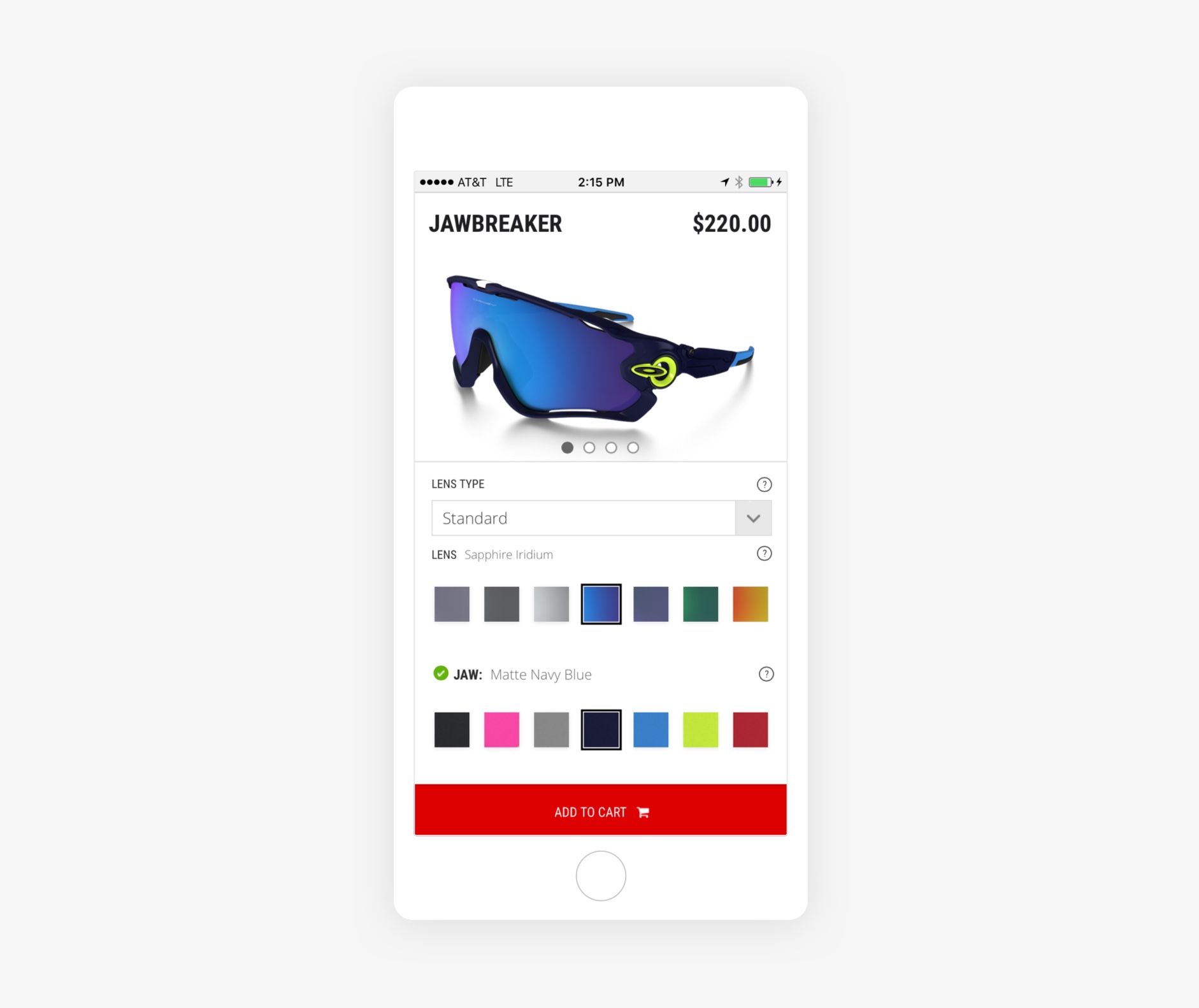
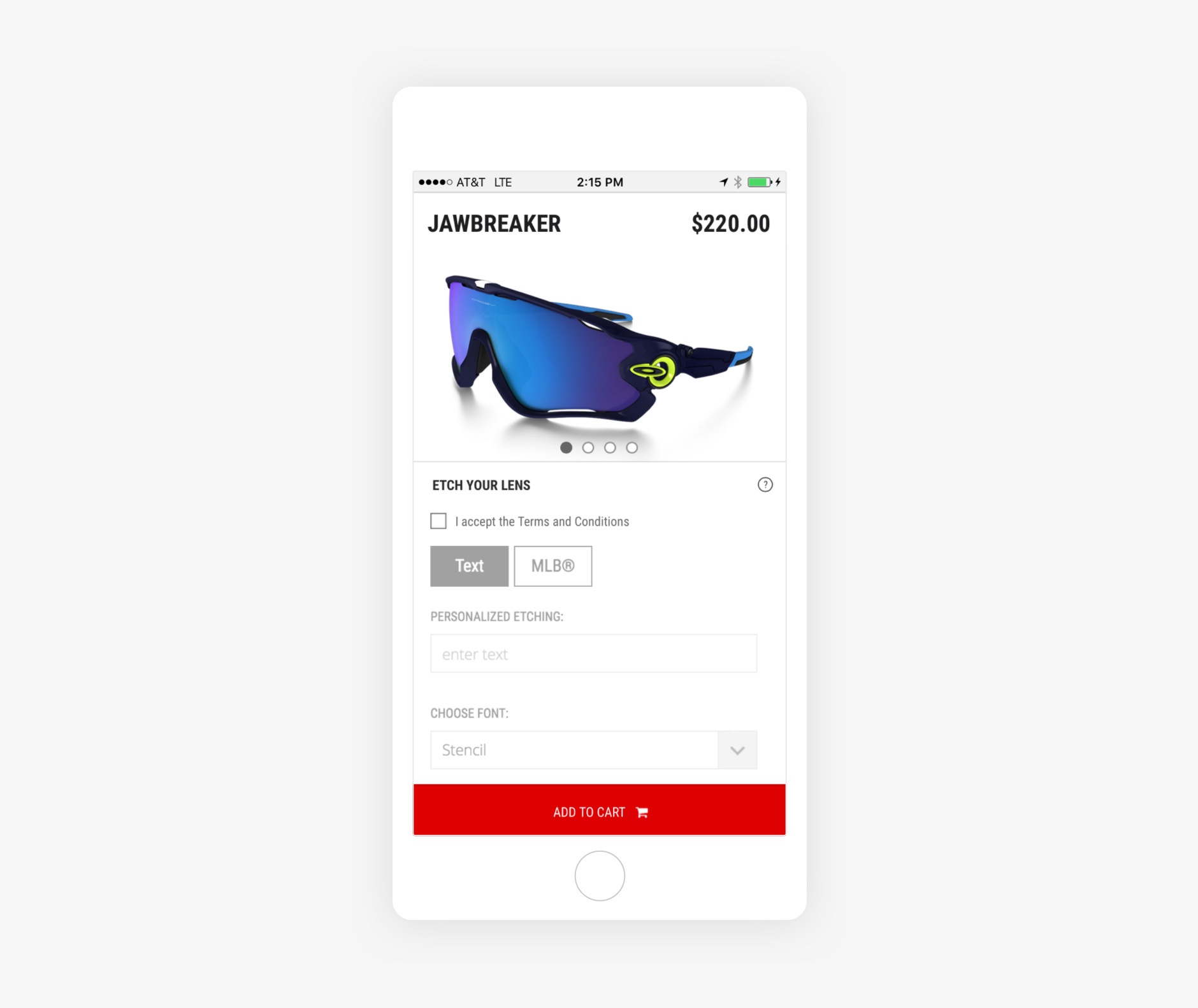
In 2015, traffic data was showing a growing trend toward mobile for Custom. The existing experience had a three key problems we wanted to solve:
• The existing interface didn’t match the latest product detail page interface, which broke consistency across a user’s potential experience.
• When scrolling to choosing customizable attributes, a user couldn’t instantly see her changes in the hero product image because the image scrolled with the rest of the page
• The Add to Cart button was out of view until the user scrolled
Solutions
• Matching the interface was pretty easy - just a matter of providing designs with updated styles to match the latest product detail page. Since we worked with a vendor to execute these updates, I managed the design, process and hand-off to the vendor development team using Zeplin.
• The scrolling issues were mainly a front-end development challenge. We worked closely with the development team to ensure execution was as we envisioned. We explained through a few meetings the “why” and also had some thoughts on the “how.” We also provided external site references to the interaction we wanted to mimic and eventually arrived at a solid solution.
What I learned
• We could have saved some time and headache explaining the scrolling interaction we envisioned to the development team with a prototype built in After Effects or Principle. Up until then, prototyping hadn’t been a part of our toolbox.
• Zeplin was a life-saver and likely made up for any time wasted on back-and-forth with the dev team on the scrolling interaction by streamlining deliverables. We realized the impact of this tool most here. Previously, we spent way too much time creating red-lined spec sheets for interaction-heavy projects like this one.
• When team members move on and it’s your responsibility to continue with a project, how do you minimize the time it takes to get familiar with the nitty-gritty of their Sketch and file organization? Fortunately, since Aaron and I collaborated closely, there was little time wasted taking over where he left off. But it’s a good idea to have a general understanding and agreement of how design files are produced in preparation for events like a teammate departure.
Thanks for reading 🙏🏻